This site mirrors blog @cankoklu click to go there.
Showing posts with label development. Show all posts

Friday, July 29, 2011

The fight gets technical: mobile apps vs. mobile sites | Econsultancy

To cover all bases, it is important to recognise that consumers are not using these channels in a mutually exclusive manner. They are using both native applications and browser-based apps, so the best strategy is to develop both types. 

The decision to invest in an app or in a mobile website depends on the company’s target audience and the functionality of the app. Companies also need to consider time, budget and resources to develop each solution.

Native, web or hybrid mobile app development?


Source: Worklight

An inherent trade-off


Source: Worklight

View/comment on the original post at blog @cankoklu

Wednesday, July 6, 2011

#Mobile #Facebook Apps are upon us! - On The Eve Of One Facebook Event, The Spartans Prepare For Another

You’ll recall that Project Spartan is the HTML5-driven mobile application platform that Facebook has been quietly building for months with the help of a group of third-party app developers. While some of those very developers believe Facebook’s intentions here is to break up the control Apple (and Google) have over the mobile app space, Facebook started freaking out when we reported that. The spin began almost immediately. And it has continued, even with the group of third-party developers working on the project — they’re affectionately known as “Spartans”.

We previously reported that after our initial story, Facebook began reaching out to the Spartans, reminding them that the information of the project was confidential (while telling the press this stuff was really “nothing new”). Since then, Facebook has stepped up their game as well. We now hear that there’s been a lot of stern talks with the Spartans, telling them that the project is not about going after Apple. But it’s not really working. “I look at these apps and how content rich they are and how they have nothing to do with Apple and everything to do with Facebook and assume that they think we are retarded,” is how one put it.

One developer says that the quality of the apps on the platform is really surprising — in a good way, naturally. Apparently, there are going to be a ton of games that will be a part of the Spartan launch. This shouldn’t be too surprising, HTML5 gaming has been something Facebook has been pushing. And Zynga is believed to be heavily involved in the project.

So when will Spartan launch? Facebook is pushing to have everyone ready by July 15. One source expects a formal unveiling to be sometime between then and August 1.

While we’ve been hesitant to provide many screenshots of what the project looks like since it could give away sources, we have secured the one below which has been slightly altered. You’ll note that it looks like a modified version of the current Facebook mobile site. Of course, two things you won’t find on the current mobile site are right there staring you in the face: Games and Apps — with notifications too!

View/comment on the original post at blog @cankoklu

Wednesday, May 11, 2011

#Android@Home: #Google Gets Serious About the Smart Home

Android@Home is a new Google framework,announced today, that will allow you to control everything in your home from an Android device. It's an exciting development from Google, which up till now has been on the periphery of the Internet of Things - the fast-evolving trend where real world objects are connected to the Internet.

http://www.readwriteweb.com/archives/androidathome_google_gets_serious_about_the_smart_home.php

View/comment on the original post at blog @cankoklu

Monday, April 18, 2011

#Mobile #Application #Development: Web vs. Native - ACM Queue

Looking to the Future

As much as native and Web are pitted against one another in this debate, the likely outcome is a hybrid solution. Perhaps we'll see computing as inherently networked and (this is my sincere hope) free for anyone to access. We already see signs of a native Web: WebGL recently proved that in-browser 3D gaming is possible, even running Quake III!

In the meantime, software makers must balance the Web-vs.-native debate based on an application's primary objectives, development and business realities, and the opportunities the Web will provide in the not-so-distant future. The good news is that until all of this technology makes it into the browser, hacks such as PhoneGap can help bridge the divide. I encourage developers not simply to identify software development trends but to implement them! If the Web doesn't fulfill a capability your particular application requires, you're presented with an exciting opportunity to contribute and close the Web/native chasm in the process.

This is just the last paragraph of a very comprehensive article.. Highly recommended reading..

View/comment on the original post at blog @cankoklu

Tuesday, March 1, 2011

Test your Website: A 57-Point Checklist for Maximum Usability | Virtual Hosting Blog

So you’ve got a website, but do you know whether it’s usable or not? The answer to this question can make the difference between a successful site and one that’s just ignored. Go through this checklist to make sure your site is up to snuff.

  1. Do you answer your user’s questions?: Users visit a site because they want answers, so it’s vitally important that your site gives them what they are looking for.
  2. Is your navigation clear and simple?: Make sure that your navigation lets the user know where they have been and where they can go in a clear, consistent manner.
  3. Do you provide anchor text?: Ensure that your visitor always knows where links are headed by discussing the site before you ask them to "click here."
  4. Does your design guide the eye?: Use color, position, size, and more to create a specific flow for your site.
  5. Do you start link names with important keywords?: Use important keywords in your links so that users know when they’ve found the right information.
  6. Is your wording straightforward?: Take a look at your language to make sure it’s simple enough for all users to understand.
  7. Does your writing look like an inverted pyramid?: Give web users the instant gratification they want by offering the most important information early on.
  8. Do you have "white space?": By placing too many elements too close together, you may overwhelm users. Spread things out a little.
  9. Have you offered contact information?: If your site doesn’t answer all of a visitor’s questions, they will probably want to speak to you about it. Allow them an easy way to contact you.
  10. Do you change URLs?: Don’t. This creates linkrot, in which links to your site are broken, and discourages other sites from linking to you in the future.
  11. Do you have a site map?: A site map is very important for a large site, because it helps lost users find their way and also makes it easy for search engines to spider your site.
  12. Does your information look like an ad?: Users will ignore information if it resembles a promotion, so avoid using large red text and other design elements found in advertisements.
  13. Does your site require unnecessary plugins?: Be aware that not everyone’s browser is fully decked out. Use a plugin only if it adds value and is absolutely necessary.
  14. Have you enabled graceful degradation?: Be sure that even if your site can’t display certain elements, the rest will still function properly.
  15. Does your logo link home?: Users expect that your site’s main logo will always link to your homepage, so make sure you’ve done this.
  16. Have you grouped information?: Make it easy for users to find what they’re looking for by arranging related information together, such as your corporate history alongside your career offerings.
  17. Do you provide visual clues for links?: Make sure that you’ve made your links obvious with colored, underlined text.
  18. Have you used color properly?: Avoid placing light-colored text on a light-colored background, or it will be hard for visitors to read your content. The same goes for dark-on-dark.
  19. Do you support deep-link users?: Check all of your site’s pages to make sure a user could orient themselves if they arrived on that page before any other place on your site.
  20. Is your site organized with a consistent structure?: Be sure to include headings, lists, and a unifying structure from page to page.
  21. Do you show users where they’ve been?: Differentiate between visited and unvisited links so that visitors can navigate with ease.
  22. Is your text annoying?: Use bold, italic, and upper-caps text sparingly.
  23. Do your graphics mean anything?: If your graphics seem irrelevant or frivilous, users won’t be impressed, so make sure that any images you use are directly related to the content.
  24. Do you date your content?: Don’t make users guess about which content is current and which is obsolete. Add dates to articles, press releases, and other content.
  25. Is your site full of animation?: Cut down on unnecessary animations to avoid overwhelming the user.
  26. Have you optimized your writing for the web?: Ensure that your text is short, scannable, and to the point, offering answers and common language.
  27. Do your links work?: Always double check your site for broken links, as they’re one of the worst user annoyances out there.
  28. Do you have a tagline?: Use a tagline to give visitors an extremely quick summary of what you do and what the site’s about.
  29. Do you offer prices?: If you’re using your website as a sales tool, it is vitally important that you answer what is almost certainly your customer’s biggest question-how much is it?
  30. Do your error messages help?: Take a look at your error messages, and consider whether they just tell the user they’re wrong, or if they actually provide suggestions for how to remedy the problem.
  31. Have you tested alternative browsers?: Although the majority of the Internet is still on Internet Explorer, it’s vital that you make sure your page renders correctly in browsers like Firefox, Safari, Opera, and more.
  32. Does your content require horizontal scrolling?: Cut down on user annoyance by ensuring that your page’s width does not exceed your visitor’s browser.
  33. Have you added descriptions to images?: Let your users know what purpose an image serves by placing information in the ALT and TITLE attributes.
  34. Do you link within a page?: If so, cut it out. Linking to a different position on the same page will confuse visitors and undermine their understanding of the browser.
  35. Is your design consistent?: Don’t leave users guessing whether they’ve stumbled upon a different site. Use similar colors and typefaces throughout your entire site.
  36. Is your name and logo on every page?: Don’t assume that just because a user is on your site, they know who you are. Place your name and logo prominently on your site.
  37. Have you accelerated to the next step?: Make it painstakingly easy for users to see where they’re supposed to go next.
  38. Does your FAQ answer real questions?: If your FAQ is full of questions that you only wish your visitors would ask, you need to reassess. Make sure that you’re actually featuring frequently asked questions so that the FAQ is actually useful.
  39. Can users find information quickly?: Follow the 3-click-rule, which states that users will stop using a site if they can’t find the information they want within 3 mouse clicks.
  40. Is your information cluttered?: If so, you need to break pages down into different sections.
  41. Are your forms too much trouble?: Cast a critical eye on your forms to make sure you’re allowing flexible inputs and not asking for unnecessary information.
  42. Is your site accessible for users with disabilities?: Check to make sure your site is readable by those with disabilities, especially the blind.
  43. Are your fonts readable?: Make your text readable by avoiding small font sizes and allowing font resizing.
  44. Is your site broken down into digestable chunks?: Follow the 7, plus or minus 2 principle, which states that users can retain only about 5-9 things at one time.
  45. Does your page load quickly?: Make sure your pages load quickly so that your website is friendly to those on slow Internet connections, or who have to pay per minute of Internet access.
  46. Is your title descriptive?: Make sure that your page title makes sense for the content you offer.
  47. Does your site render correctly in different screen resolutions?: If you’re only optimized for 1024×767, you’re rendering your site incorrectly to a lot of visitors.
  48. Offer a search function: Make it incredibly easy for users to find information by providing a search box.
  49. Have you outlined a privacy policy?: It drives users crazy to give away their contact information without knowing what will be done with it. Make it explicitly clear whether you’ll sell their email address, and how often they’ll get email from you.
  50. Do you have a liquid layout?: Frozen layouts and fixed page widths make it difficult for large browsers to render your page, and this design poses problems with printing.
  51. Does your content have spelling errors?: Check your content for errors in spelling or grammar, and don’t rely solely on a spell-check function because sometimes that software’s online engineering isn’t perfect.
  52. Use tabs responsibly: Use tabs to change views while still in the same context, and make them incredibly readable and logically broken up.
  53. Is your splash page absolutely necessary?: Most users prefer to get right to the content instead of watching and waiting for a splash page to complete.
  54. Do you have a brandable URL?: Use a short URL so that it can be easily relayed from one user to the next, and you’ll make viral marketing easier to come by.
  55. Have you filled out TITLE and META tags?: Make sure you’ve filled out this information to let users and search engines know what your site’s all about.
  56. Do you emphasize high-priority tasks?: Make sure that your homepage highlights the important actions you’d like visitors to make.
  57. Do users know when they’re clicking an email link?: Ensure that users know when to expect their email program to pop up.

View/comment on the original post at blog @cankoklu

Tuesday, February 22, 2011

10 Rock Solid Website Layout Examples - Designshack.co.uk

Three Boxes

This is probably the most simple layout on the list. In fact, you’ll be tempted to think that it’s far too simple to ever fit your own needs. If this is the case, you’ll be surprised if you really put some thought into how versatile the arrangement really is.

The three boxes layout features one main graphic area followed by two smaller boxes underneath. Each of these can be filled with a graphic, a block of text or a mixture of both. The main box in this layout is often a jQuery slider, capable of showcasing as much content as you want!

The silhouetted shapes along the top are areas that can be used for logos, company names, navigation, search bars and any other informational and functional content typically on a website.

screenshot

This design is ideal for a portfolio page or anything that needs to show off a few sample graphics. Each of the images could be a link that leads to a larger, more complex gallery page. Later in the article we’ll see how to mix this idea up even further.

3D Screenshots

As developers continue to create an endless collection of webapps, the 3D screenshots layout seen below, or some variant of it, is becoming more and more popular. The basic idea is to top your page with a headline and then toss in some stylized previews of your application. These often come with reflections, heavy shadows, big background graphics, or even complex adornments such as vines crawling all over the screenshots, but the core idea is always really simple.

screenshot

Another place I see this trick used a lot is in pre-built themes. In these cases, a designer is selling a stock layout and really needs his/her placeholder graphics to shine, and nothing says cool and modern like some fancy 3D effects!

Advanced Grid

Many of the layouts that you’ll see in this article adhere to a pretty strict grid alignment. However, for the most part, they don’t simply suggest a page full of uniform thumbnails. For instance, the layout below mixes up the size of the images to avoid redundancy.

As with the three boxes example, there’s one primary graphic heading up the page. This is followed by a simple twist on the idea of a uniform grid of thumbnails. The space would allow for a span of four squares horizontally, but instead we’ve combined the first two areas so that the left half of the page differs from the right.

screenshot

As we mentioned with the first layout, the blocks don’t have to be images. For example, you can imagine this as blocks of text on the left flanking square images on the right.

Featured Graphic

Sometimes you don’t have enough content for a page full of images. So what do you do if you want to showcase one icon, photo or perhaps even a symbol such as an ampersand? The layout below is a super easy solution that is quite popular and reads very well due to the lack of distractions.

screenshot

The result is a page that is bold, yet minimal and clean. The statement it makes is strong and impossible to miss, just make sure your graphic is good enough to be featured so prominently!

Five Boxes

The five boxes layout is simply an evolution of the three boxes layout. All of the same logic applies, it’s just been modified to hold even more content. It could easily be four boxes as well, it just depends on what you want to showcase. It also makes it look like you put a little more effort into the design!

Obviously, as you add to the layout, the secondary items become smaller and smaller so for most uses, five boxes is probably going to approach the limit.

screenshot

Just as with the three box layout, this one is so versatile that it can literally be used on just about any type of site. Ideas for switching it up include adding a large background graphic, rounding the corners, adding shadows and/or reflections, or perhaps even adding an interactive element to the smaller thumbnails. You could easily add in buttons that cause them to scroll horizontally.

Fixed Sidebar

Thus far all the sites that we’ve seen have had a top-side horizontal navigation. The other popular option is of course a vertical navigation, which lends itself to creating a strong vertical column on the left side of the page. Often this is a fixed element that stays where it is while the rest of the page scrolls. The reason for this is so the navigation can stay easily accessible from any point in the site.

screenshot

The rest of the content can borrow from one of the other layouts on this list. Notice that I’ve again modified the three box layout, this time in a four box arrangement. Once you’re done reading this article, look at all the layouts again and think about how you can mix and match the ideas to create new layouts.

Headline & Gallery

Everyone loves a good gallery page. From a layout perspective, what could be simpler? All you need is a solid, uniform grid of images and some room for a headline with an optional sub-head. The key here is to make your headline big and bold. Feel free to use this as a point of creativity and include a script or some crazy typeface.

screenshot

This example uses squished rectangles to mirror the real site below, but this can and should be modified to fit whatever you’re showing off. The point here is to get you to think outside the box and not default to a square, maybe you could use vertical rectangles or even circles in your own gallery!

Featured Photo

The layout below is extremely common, especially among the photography community. The basic idea here is to have a large image displaying either your design or photography (anything really), accompanied by a left-side vertical navigation.

screenshot

The navigation might be the strongest in a left alignment, but feel free to experiment with a center or even right alignment to compliment the straight edge of the photo.

Power Grid

The power grid is the most complex layout in this article, but it is one of the most effective layouts I’ve seen for pages that need to contain all kinds of various related content. From images and music players to text and videos, you can cram just about anything into this layout and it stays strong.

screenshot

The key lies in the bottom half of the preview above. Notice that there’s actually a large container that holds a series of rectangles. This container provides you with the boundaries for your space, and all the content you place inside should be formatted in a strong but varied grid, not unlike the advanced grid layout near the beginning of this article.

Full Screen Photo

The final layout on the list is another that is ideally suited for photographers, but will work on any site with a big, attractive background graphic to display and a limited amount of content.

It can be really hard to read content when it is laid over a background image, so the basic idea here is to create an opaque (or nearly opaque) horizontal bar that sits on top of the image and serves as a container for links, copy, logos and other content.

screenshot

Rather than using the bar as one really wide content area, try splitting it into a few different sections. This can be done by varying the background color, adding some subtle vertical lines as dividers or even actually breaking the big box into smaller disconnected boxes as I’ve done above.

Check out Designshack for real life examples of each layout.

View/comment on the original post at blog @cankoklu

Friday, February 11, 2011

Nokia Confirms Microsoft Partnership, New Leadership Team, Organizational Changes

Here’s the meat:

- Plans for a broad strategic partnership with Microsoft to build a new global mobile ecosystem; Windows Phone would serve as Nokia’s primary smartphone platform.
- A renewed approach to capture volume and value growth to connect “the next billion” to the Internet in developing growth markets
- Focused investments in next-generation disruptive technologies
- A new leadership team and organizational structure with a clear focus on speed, results and accountability

Windows Phone to become Nokia’s primary smartphone platform = huge. Microsoft reportedly offered Nokia hundreds of millions of dollars to make that switch.

Nokia will use Bing for search functionality across its devices, while Nokia Maps will become core to Microsoft’s mapping services. Nokia’s content and app store will be integrated with Microsoft’s Marketplace. More info about the partnership is available here.

View/comment on the original post at blog @cankoklu

Monday, January 31, 2011

Avoiding Web Habits in Your iPhone Apps #ux

  • Reset expectations about typing. Typing is so commonplace these days, we barely think about it. But no matter how speedy someone is on a mobile keyboard, it is always easier to select text on a touch device than it is to type it. Before you add a text field ask yourself: is this absolutely necessary? 

If it makes sense for your application, dynamically populate a list of possible answers below an input field once the user starts typing a letter or two (Google and Path are two of the many apps with this type of autocomplete functionality). Shave seconds off of interactions wherever you can because those seconds add up!
  • Condense labels for forms and tables. Brevity is always advisable on the web, but it’s nonnegotiable in iOS. Any time label text for table elements is wrapped or truncated it interrupts the visual flow. Keep labels as short as possible without sacrificing meaning.
  • Rethink forms. Instead of a consecutive list of questions and input fields on one long screen, think about forms on iOS as several quick interactions strung together. It’s helpful to maintain consistency with iOS standard controls by keeping cancel/back and submit/next buttons in the navigation bar at the top. The best forms are not drudgery to the user but just steps that must be taken to get something useful done.
  • Take advantage of gestures, but… Gestures are tricky because they’re easy to both under and overuse.  There are three ways that I find gestures most appropriate:
    1. Offer them in the same way you might offer a keyboard shortcut in a desktop application — it’s there for improved experience and efficiency, but it’s not necessary to make the app function.
    2. Use them if you have created realistic controls that mimic real-world interactions.
    3. Present them in your app when you need to require deliberate intention (like answering your phone or deleting an account).
  • Think in taps, not clicks. A finger tip is infinitely bigger than the tip of a mouse pointer and that significantly affects your interface. Once you have a wireframe or mockup put together for a screen of your app, step back and look at it. Does it look like Honey I Shrunk the Web Page with lots of touchable areas crunched together? Is someone with thick fingertips going to be tempted to throw their phone across the room out of frustration? This seems obvious, but it is can be a daunting challenge to stop thinking in clicks.
  • Don’t go overboard. It’s easy to swing too far in the other direction and use an array of different native elements because they’re there. The switch is an example of an element that has been widely overused because of its novelty. Well-placed interface elements put the people using your app in control, but superfluous interactions can make them feel like your marionette. A critical eye and some honest colleagues will help prevent interface bloat.

Instead of strictly following these guidelines, which will change as the platform changes, it’s best to focus on thinking critically about the medium and the people your product reaches. The advent of hundreds of millions of mobile touch devices is revolutionizing the way we think about the web and even desktop applications. Stay ahead of the curve by challenging your paradigms now!

View/comment on the original post at blog @cankoklu

Monday, December 27, 2010

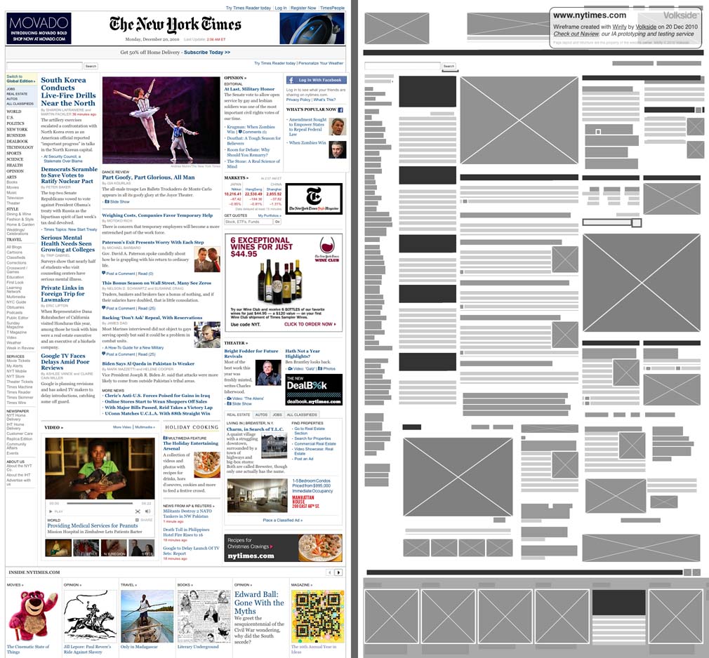
Volkside | Introducing Wirify: The web as wireframes

Wirify is a bookmarklet that lets you turn any web page into a wireframe in one click. It’s lightweight and works in many modern browsers. To use Wirify drag the link below to your Bookmarks toolbar (or right-click > Add to Favorites in IE):

Then go to your favourite web page and click “Wirify by Volkside” in your bookmarks toolbar -- it’s as simple as that!

The following wireframes have been created using Wirify today and besides basic cropping and resizing they are completely unedited:

New York Times - Original vs Wirify wireframe

Source: The New York Times

Wikipedia - Original vs Wirify wireframe

View/comment on the original post at blog @cankoklu

Monday, December 20, 2010

The Best HTML5 Game Yet: A Threat To Flash? | ConceivablyTech

HTML5 game: Pirates Love Daisies

HTML5 game: Pirates Love Daisies

The game “Pirates Love Daisies” was developed by Grant Skinner for Microsoft’s Internet Explorer team. Skinner usually develops Flash applications and is, in fact, among the most prominent Flash developers on the planet. This time, however, Microsoft asked him to work with HTML5 and only HTML5. The result is a tower defense strategy game that is buggy at advanced levels, according to my 9-year old tower defense expert at home, but that is just as captivating as Flash based tower defense games. The controls are similar and the graphics, while always a matter of taste, appeared to be slightly more sophisticated in their effects than your average tower defense game.

View/comment on the original post at blog @cankoklu

Thursday, November 11, 2010

1.0 Is the Loneliest Number — Matt Mullenweg

Usage is like oxygen for ideas. You can never fully anticipate how an audience is going to react to something you’ve created until it’s out there. That means every moment you’re working on something without it being in the public it’s actually dying, deprived of the oxygen of the real world. It’s even worse because development doesn’t happen in a vacuum — if you have a halfway decent idea, you can be sure that there are two or three teams somewhere in the world that independently came up with it and are working on the same thing, or something you haven’t even imagined that disrupts the market you’re working in. (Think of all the podcasting companies — including Ev Williams’ Odeo — before iTunes built podcasting functionality in.)

By shipping early and often you have the unique competitive advantage of hearing from real people what they think of your work, which in best case helps you anticipate market direction, and in worst case gives you a few people rooting for you that you can email when your team pivots to a new idea. Nothing can recreate the crucible of real usage.

via ma.tt

View/comment on the original post at blog @cankoklu

Thursday, September 30, 2010

Twelve (12) emerging best practice for adding user experience work to agile software development

  1. Drive: UX practitioners are part of the customer or product owner team
  2. Research, model, and design up front - but only just enough
  3. Chunk your design work
  4. Use parallel track development to work ahead, and follow behind
  5. Buy design time with complex engineering stories
  6. Cultivate a user validation group for use for continuous user validation
  7. Schedule continuous user research in a separate track from development
  8. Leverage user time for multiple activities
  9. Use RITE to iterate UI before development
  10. Prototype in low fidelity
  11. Treat prototype as specification
  12. Become a design facilitator
Lots of details on each point at agileproductdesign.com

View/comment on the original post at blog.cankoklu

Monday, September 27, 2010

Complete Beginner’s Guide to Information Architecture | UX Booth

Timothy Greig structures the information flow of a library website.

Photo by Timothy Greig

Information architecture is an often misunderstood job title. Are they Designers? Developers? Managers? All of the above? In this article we’ll discuss what information architecture is, why it’s related to usability, and what are the common tools/programs used in information architecture.

View/comment on the original post at blog.cankoklu

Thursday, September 23, 2010

Never Mind the Bullets - BEAUTY OF THE WEB

As the web and its technologies continue to evolve, we prepare to enter the age of HTML5. Created for «Beauty of the Web» in honor of the launch of Internet Explorer 9, «Never Mind the Bullets» offers the traditional comic strip experience enriched by the effects of parallax. By a simple movement of the mouse the strip becomes animated and the story comes to life. The story unfolds at LongHorn Gush, a quiet town troubled by a band of outlaws that call themselves «The Red Bandanas». However, with the arrival of the famous Bill «One Shot» Collins things are about to change...

You really have to check out the site to understand this..

View/comment on the original post at blog.cankoklu

Tuesday, September 7, 2010

A List Apart: Articles: Strategic Content Management

Content strategy is shaking up the CMS industry

The rise of content strategy is dealing the content management industry a huge kick up the backside. In the web’s Wild West era, the CMS was run by the IT department—or sometimes a lone webmaster who knew HTML—so CMS choices were based on features, price, and cultural fit, rather than web or content strategy. It was the classic IT drill: selection committees, feature matrices, and business lunches with men wearing neckties.

The times they are a-changin’. According to Lisa Welchman, the web is now “the organization’s primary communications, sales, marketing, and transactional vehicle.” A CMS vendor’s target audience used to be the IT Director, and a successful outcome meant each department could easily update their content silo. Now, the target audience is an organization’s internal editorial infrastructure; and a successful outcome is a complex mix of achieving business objectives, implementing a content strategy, and crafting a user experience. The game just got more serious.

View/comment on the original post at blog.cankoklu