Wednesday, June 29, 2011

Thursday, May 5, 2011
10 Super Easy SEO Copywriting Tips for Improved Link Building | SEOmoz
Compare the two posts below, both written by the exact same SEO expert and each containing around the same number of words. Without knowing the subject, can you guess which post earned more links?
Try 378 to 6. In addition to its visual appeal, the left post was more timely, useful and informative - all hallmarks of copywriting grace.


Tuesday, April 26, 2011
Why Users Click Right Call to Actions More Than Left - #UX Movement
There are many home page focal points that put their call to action buttons in the bottom left area. This is the weak fallow area that users pay the least attention to. Users may sweep their eyes across your call to action button, but they won’t fixate on it for long. When the user finishes viewing and ends at the terminal area, they have to move their eyes back to the weak fallow area to click the call to action button. This not only forces users to move their eyes more, but going back to the weak fallow area is an unnatural movement that goes against their viewing rhythm. Call to actions belong in the terminal area because they’re the last thing users need to see to take action.

The example below arranges the home page focal point elements perfectly. The headline, which users read first, is in the primary optical area where users first look. The supporting text, which users read after the headline, is in the strong fallow area, where users move their eyes to second. The product image, which users look at after they read, is in the weak fallow area. This is the best spot for the product image because images tend to get longer visual fixations. Placing it in the weak fallow area means that the image won’t get fixated on too long over other elements. Each element is efficiently placed so that it follows the user’s natural viewing pattern. A call to action in the terminal area makes it quick and easy for users to take action.

The difference between a left and right call to action may only seem like its placement. But when you look deeper, where you place your call to actions can affect whether users click them or not. Knowing this will allow you to promote and display your product in an efficient way that makes users act.
source: http://uxmovement.com/buttons/why-users-click-right-call-to-actions-more-than-left
Monday, April 4, 2011
Multivariate Testing 101: A Scientific Method Of Optimizing Design - Smashing Magazine
Do’s And Don’ts
I have observed hundreds of multivariate tests, and I have seen many people make the same mistakes. Here is some practical advice, direct from my experience.
Don’ts
- Don’t include a lot of sections in the test.
Every section you add effectively doubles the number of combinations to test. For example, if you’re testing a headline and image, then there are a total of four combinations (2 × 2). If you add a button to the test, there are suddenly eight combinations to test (2 × 2 × 2). The more combinations, the more traffic you’ll need to get significant results.Do’s
- Do preview all combinations.
In multivariate testing, variations of a section (image, headline, button, etc.) are combined to create page variations. One of the combinations might be odd-looking or, worse, illogical or incompatible. For example, one combination might put together a headline that says “$15 off” and a button that says “Free subscription.” Those two messages are incompatible. Detect and remove incompatibilities at the preview stage.- Do decide which sections are most worthy of inclusion in the test.
In a multivariate test, not all sections will have an equal impact on the conversion rate. For example, if you include a headline, a call-to-action button and a footer, you might come to realize that footer variations have little impact, and that headline and call-to-action variations produce winning combinations. You get a powerful section-specific report. Below is a sample report from Visual Website Optimizer. Notice how the button has more impact (91%) than the headline (65%):
- Do estimate the traffic needed for significant results.
Before testing, get a clear idea of how much traffic you’ll need in order to get statistically significant results. I’ve seen people add tens of sections to a page that gets just 100 visitors per day. Significant results from such a test would take months to accumulate. I suggest using a calculator, such as this A/B split and multivariate testing duration calculator, to estimate how much traffic your test will require. If it’s more than what’s acceptable, reduce some sections.

Monday, March 28, 2011
Testing Checkout Sign-In Pages: Inspiration Gallery « Get Elastic Ecommerce Blog
The checkout process is a popular area of your site to test, and for good reason. When a visitor has added items to cart and clicks the “proceed to checkout” button, it’s a good indication of purchase intent! But often carts are abandoned early in the process – even at the login screen. Your design and copy on this page have a major impact on whether customers figure out which option is right for them (sign in, create account or guest checkout) and make it smoothly through to the next step.
As I’ve written about before, Amazon and Sears’ radio button approach is likely the “path of least resistance.” But if you want to test for yourself, the following is an inspiration gallery of 4 different approaches to log in: the aforementioned radio button, two-option, three-option and expanded/one-page.
Must read for anyone involved in usability and web design..
Thursday, March 24, 2011
Monday, March 7, 2011

Tuesday, March 1, 2011
Test your Website: A 57-Point Checklist for Maximum Usability | Virtual Hosting Blog
So you’ve got a website, but do you know whether it’s usable or not? The answer to this question can make the difference between a successful site and one that’s just ignored. Go through this checklist to make sure your site is up to snuff.
- Do you answer your user’s questions?: Users visit a site because they want answers, so it’s vitally important that your site gives them what they are looking for.
- Is your navigation clear and simple?: Make sure that your navigation lets the user know where they have been and where they can go in a clear, consistent manner.
- Do you provide anchor text?: Ensure that your visitor always knows where links are headed by discussing the site before you ask them to "click here."
- Does your design guide the eye?: Use color, position, size, and more to create a specific flow for your site.
- Do you start link names with important keywords?: Use important keywords in your links so that users know when they’ve found the right information.
- Is your wording straightforward?: Take a look at your language to make sure it’s simple enough for all users to understand.
- Does your writing look like an inverted pyramid?: Give web users the instant gratification they want by offering the most important information early on.
- Do you have "white space?": By placing too many elements too close together, you may overwhelm users. Spread things out a little.
- Have you offered contact information?: If your site doesn’t answer all of a visitor’s questions, they will probably want to speak to you about it. Allow them an easy way to contact you.
- Do you change URLs?: Don’t. This creates linkrot, in which links to your site are broken, and discourages other sites from linking to you in the future.
- Do you have a site map?: A site map is very important for a large site, because it helps lost users find their way and also makes it easy for search engines to spider your site.
- Does your information look like an ad?: Users will ignore information if it resembles a promotion, so avoid using large red text and other design elements found in advertisements.
- Does your site require unnecessary plugins?: Be aware that not everyone’s browser is fully decked out. Use a plugin only if it adds value and is absolutely necessary.
- Have you enabled graceful degradation?: Be sure that even if your site can’t display certain elements, the rest will still function properly.
- Does your logo link home?: Users expect that your site’s main logo will always link to your homepage, so make sure you’ve done this.
- Have you grouped information?: Make it easy for users to find what they’re looking for by arranging related information together, such as your corporate history alongside your career offerings.
- Do you provide visual clues for links?: Make sure that you’ve made your links obvious with colored, underlined text.
- Have you used color properly?: Avoid placing light-colored text on a light-colored background, or it will be hard for visitors to read your content. The same goes for dark-on-dark.
- Do you support deep-link users?: Check all of your site’s pages to make sure a user could orient themselves if they arrived on that page before any other place on your site.
- Is your site organized with a consistent structure?: Be sure to include headings, lists, and a unifying structure from page to page.
- Do you show users where they’ve been?: Differentiate between visited and unvisited links so that visitors can navigate with ease.
- Is your text annoying?: Use bold, italic, and upper-caps text sparingly.
- Do your graphics mean anything?: If your graphics seem irrelevant or frivilous, users won’t be impressed, so make sure that any images you use are directly related to the content.
- Do you date your content?: Don’t make users guess about which content is current and which is obsolete. Add dates to articles, press releases, and other content.
- Is your site full of animation?: Cut down on unnecessary animations to avoid overwhelming the user.
- Have you optimized your writing for the web?: Ensure that your text is short, scannable, and to the point, offering answers and common language.
- Do your links work?: Always double check your site for broken links, as they’re one of the worst user annoyances out there.
- Do you have a tagline?: Use a tagline to give visitors an extremely quick summary of what you do and what the site’s about.
- Do you offer prices?: If you’re using your website as a sales tool, it is vitally important that you answer what is almost certainly your customer’s biggest question-how much is it?
- Do your error messages help?: Take a look at your error messages, and consider whether they just tell the user they’re wrong, or if they actually provide suggestions for how to remedy the problem.
- Have you tested alternative browsers?: Although the majority of the Internet is still on Internet Explorer, it’s vital that you make sure your page renders correctly in browsers like Firefox, Safari, Opera, and more.
- Does your content require horizontal scrolling?: Cut down on user annoyance by ensuring that your page’s width does not exceed your visitor’s browser.
- Have you added descriptions to images?: Let your users know what purpose an image serves by placing information in the ALT and TITLE attributes.
- Do you link within a page?: If so, cut it out. Linking to a different position on the same page will confuse visitors and undermine their understanding of the browser.
- Is your design consistent?: Don’t leave users guessing whether they’ve stumbled upon a different site. Use similar colors and typefaces throughout your entire site.
- Is your name and logo on every page?: Don’t assume that just because a user is on your site, they know who you are. Place your name and logo prominently on your site.
- Have you accelerated to the next step?: Make it painstakingly easy for users to see where they’re supposed to go next.
- Does your FAQ answer real questions?: If your FAQ is full of questions that you only wish your visitors would ask, you need to reassess. Make sure that you’re actually featuring frequently asked questions so that the FAQ is actually useful.
- Can users find information quickly?: Follow the 3-click-rule, which states that users will stop using a site if they can’t find the information they want within 3 mouse clicks.
- Is your information cluttered?: If so, you need to break pages down into different sections.
- Are your forms too much trouble?: Cast a critical eye on your forms to make sure you’re allowing flexible inputs and not asking for unnecessary information.
- Is your site accessible for users with disabilities?: Check to make sure your site is readable by those with disabilities, especially the blind.
- Are your fonts readable?: Make your text readable by avoiding small font sizes and allowing font resizing.
- Is your site broken down into digestable chunks?: Follow the 7, plus or minus 2 principle, which states that users can retain only about 5-9 things at one time.
- Does your page load quickly?: Make sure your pages load quickly so that your website is friendly to those on slow Internet connections, or who have to pay per minute of Internet access.
- Is your title descriptive?: Make sure that your page title makes sense for the content you offer.
- Does your site render correctly in different screen resolutions?: If you’re only optimized for 1024×767, you’re rendering your site incorrectly to a lot of visitors.
- Offer a search function: Make it incredibly easy for users to find information by providing a search box.
- Have you outlined a privacy policy?: It drives users crazy to give away their contact information without knowing what will be done with it. Make it explicitly clear whether you’ll sell their email address, and how often they’ll get email from you.
- Do you have a liquid layout?: Frozen layouts and fixed page widths make it difficult for large browsers to render your page, and this design poses problems with printing.
- Does your content have spelling errors?: Check your content for errors in spelling or grammar, and don’t rely solely on a spell-check function because sometimes that software’s online engineering isn’t perfect.
- Use tabs responsibly: Use tabs to change views while still in the same context, and make them incredibly readable and logically broken up.
- Is your splash page absolutely necessary?: Most users prefer to get right to the content instead of watching and waiting for a splash page to complete.
- Do you have a brandable URL?: Use a short URL so that it can be easily relayed from one user to the next, and you’ll make viral marketing easier to come by.
- Have you filled out TITLE and META tags?: Make sure you’ve filled out this information to let users and search engines know what your site’s all about.
- Do you emphasize high-priority tasks?: Make sure that your homepage highlights the important actions you’d like visitors to make.
- Do users know when they’re clicking an email link?: Ensure that users know when to expect their email program to pop up.
Monday, February 28, 2011
Tuesday, February 22, 2011
10 Rock Solid Website Layout Examples - Designshack.co.uk
Three Boxes
This is probably the most simple layout on the list. In fact, you’ll be tempted to think that it’s far too simple to ever fit your own needs. If this is the case, you’ll be surprised if you really put some thought into how versatile the arrangement really is.
The three boxes layout features one main graphic area followed by two smaller boxes underneath. Each of these can be filled with a graphic, a block of text or a mixture of both. The main box in this layout is often a jQuery slider, capable of showcasing as much content as you want!
The silhouetted shapes along the top are areas that can be used for logos, company names, navigation, search bars and any other informational and functional content typically on a website.
This design is ideal for a portfolio page or anything that needs to show off a few sample graphics. Each of the images could be a link that leads to a larger, more complex gallery page. Later in the article we’ll see how to mix this idea up even further.
3D Screenshots
As developers continue to create an endless collection of webapps, the 3D screenshots layout seen below, or some variant of it, is becoming more and more popular. The basic idea is to top your page with a headline and then toss in some stylized previews of your application. These often come with reflections, heavy shadows, big background graphics, or even complex adornments such as vines crawling all over the screenshots, but the core idea is always really simple.
Another place I see this trick used a lot is in pre-built themes. In these cases, a designer is selling a stock layout and really needs his/her placeholder graphics to shine, and nothing says cool and modern like some fancy 3D effects!
Advanced Grid
Many of the layouts that you’ll see in this article adhere to a pretty strict grid alignment. However, for the most part, they don’t simply suggest a page full of uniform thumbnails. For instance, the layout below mixes up the size of the images to avoid redundancy.
As with the three boxes example, there’s one primary graphic heading up the page. This is followed by a simple twist on the idea of a uniform grid of thumbnails. The space would allow for a span of four squares horizontally, but instead we’ve combined the first two areas so that the left half of the page differs from the right.
As we mentioned with the first layout, the blocks don’t have to be images. For example, you can imagine this as blocks of text on the left flanking square images on the right.
Featured Graphic
Sometimes you don’t have enough content for a page full of images. So what do you do if you want to showcase one icon, photo or perhaps even a symbol such as an ampersand? The layout below is a super easy solution that is quite popular and reads very well due to the lack of distractions.
The result is a page that is bold, yet minimal and clean. The statement it makes is strong and impossible to miss, just make sure your graphic is good enough to be featured so prominently!
Five Boxes
The five boxes layout is simply an evolution of the three boxes layout. All of the same logic applies, it’s just been modified to hold even more content. It could easily be four boxes as well, it just depends on what you want to showcase. It also makes it look like you put a little more effort into the design!
Obviously, as you add to the layout, the secondary items become smaller and smaller so for most uses, five boxes is probably going to approach the limit.
Just as with the three box layout, this one is so versatile that it can literally be used on just about any type of site. Ideas for switching it up include adding a large background graphic, rounding the corners, adding shadows and/or reflections, or perhaps even adding an interactive element to the smaller thumbnails. You could easily add in buttons that cause them to scroll horizontally.
Fixed Sidebar
Thus far all the sites that we’ve seen have had a top-side horizontal navigation. The other popular option is of course a vertical navigation, which lends itself to creating a strong vertical column on the left side of the page. Often this is a fixed element that stays where it is while the rest of the page scrolls. The reason for this is so the navigation can stay easily accessible from any point in the site.
The rest of the content can borrow from one of the other layouts on this list. Notice that I’ve again modified the three box layout, this time in a four box arrangement. Once you’re done reading this article, look at all the layouts again and think about how you can mix and match the ideas to create new layouts.
Headline & Gallery
Everyone loves a good gallery page. From a layout perspective, what could be simpler? All you need is a solid, uniform grid of images and some room for a headline with an optional sub-head. The key here is to make your headline big and bold. Feel free to use this as a point of creativity and include a script or some crazy typeface.
This example uses squished rectangles to mirror the real site below, but this can and should be modified to fit whatever you’re showing off. The point here is to get you to think outside the box and not default to a square, maybe you could use vertical rectangles or even circles in your own gallery!
Featured Photo
The layout below is extremely common, especially among the photography community. The basic idea here is to have a large image displaying either your design or photography (anything really), accompanied by a left-side vertical navigation.
The navigation might be the strongest in a left alignment, but feel free to experiment with a center or even right alignment to compliment the straight edge of the photo.
Power Grid
The power grid is the most complex layout in this article, but it is one of the most effective layouts I’ve seen for pages that need to contain all kinds of various related content. From images and music players to text and videos, you can cram just about anything into this layout and it stays strong.
The key lies in the bottom half of the preview above. Notice that there’s actually a large container that holds a series of rectangles. This container provides you with the boundaries for your space, and all the content you place inside should be formatted in a strong but varied grid, not unlike the advanced grid layout near the beginning of this article.
Full Screen Photo
The final layout on the list is another that is ideally suited for photographers, but will work on any site with a big, attractive background graphic to display and a limited amount of content.
It can be really hard to read content when it is laid over a background image, so the basic idea here is to create an opaque (or nearly opaque) horizontal bar that sits on top of the image and serves as a container for links, copy, logos and other content.
Rather than using the bar as one really wide content area, try splitting it into a few different sections. This can be done by varying the background color, adding some subtle vertical lines as dividers or even actually breaking the big box into smaller disconnected boxes as I’ve done above.


Check out Designshack for real life examples of each layout.
Monday, January 24, 2011
Improving Conversion After the Add-To-Cart « Get Elastic Ecommerce Blog
It’s a bit blurry in the screenshot, but the calls to action are stacked (groan), and given equal “weight” (size, color and prominence). The top button says “keep shopping,” the bottom “shopping bag.” The product page’s content and cross-sells compete with the calls to action, and they appear to get no action from eyeballs.
Check out how a smart redesign fades out the background, fixes the button styling and changes the “shopping bag” label to “view shopping bag” (more clarity).
The impact on attention is remarkable:


nice..
Wednesday, January 19, 2011

Friday, January 7, 2011
Creative Use Of Video in Web Design: Background Videos - Smashing Magazine
The performance of a website including a background video depends significantly on the speed of the user’s internet connection. Video backgrounds certainly do not fit in every setting; they wouldn’t be meaningful in online magazines or blogs. However, they can work really well in entertainment and certain corporate settings which are supposed to communicate artistic qualities, exclusivity, branding or even high quality standards. As you will see, they work very well in portfolio websites, fashion websites and promotional campaigns. Below you’ll find a showcase of good and not so good websites that implement this dynamic eye candy at full screen.
Monday, December 27, 2010
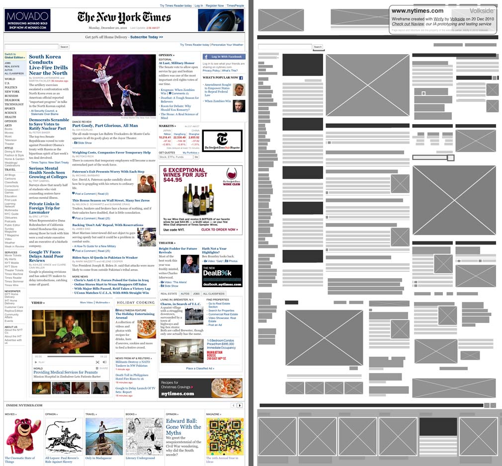
Volkside | Introducing Wirify: The web as wireframes
Wirify is a bookmarklet that lets you turn any web page into a wireframe in one click. It’s lightweight and works in many modern browsers. To use Wirify drag the link below to your Bookmarks toolbar (or right-click > Add to Favorites in IE):
Then go to your favourite web page and click “Wirify by Volkside” in your bookmarks toolbar -- it’s as simple as that!
The following wireframes have been created using Wirify today and besides basic cropping and resizing they are completely unedited:
Source: The New York Times


Wednesday, December 22, 2010
5 Predictions for Online Data In 2011
Summary
In the midst of all the data-driven innovation we are seeing, this will be also the year of separating the non-trivial from the trivial.
It’s one thing to acquire terabytes of data, and it’s quite another to cleanse, disambiguate and mobilize that data in service of real-time insights into markets young and old.
The intellectual and experiential barrier to entry in social media, I think it’s fair to argue, is relatively low. It’s therefore harder to distinguish oneself, but certainly easy to get started. That’s been the beauty of the experiment all along.
Until now, data science and data marketing have been relegated to the realm of a self-selecting and highly motivated few, but as new tools democratize access, we’ll start to see a different dynamic.
But with great power comes… well, the Mark Twain quote I used last time still applies: “There are three kinds of lies — lies, damned lies, and statistics.”
Data can create new insights and open new opportunities, but it can also be twisted to serve an agenda or simply tell us what we want to hear.
It’s all in there, though — there in the data somewhere, if you know what you’re doing and how to do it well. Data knows everything we know, everything we don’t know, and, as it turns out, even a few things we don’t know we don’t know.
Monday, December 20, 2010
The Best HTML5 Game Yet: A Threat To Flash? | ConceivablyTech
HTML5 game: Pirates Love Daisies
The game “Pirates Love Daisies” was developed by Grant Skinner for Microsoft’s Internet Explorer team. Skinner usually develops Flash applications and is, in fact, among the most prominent Flash developers on the planet. This time, however, Microsoft asked him to work with HTML5 and only HTML5. The result is a tower defense strategy game that is buggy at advanced levels, according to my 9-year old tower defense expert at home, but that is just as captivating as Flash based tower defense games. The controls are similar and the graphics, while always a matter of taste, appeared to be slightly more sophisticated in their effects than your average tower defense game.

Wednesday, December 1, 2010
Persuasion Triggers in Web Design - Smashing Magazine
Cognitive biases like these play a significant role in the way we make decisions so it’s not surprising that people are now examining these biases to see how to exploit them in the design of web sites. I’m going to use the term ‘persuasion architects’ to describe designers who knowingly use these techniques to influence the behaviour of users. (Many skilled designers already use some of these psychological techniques intuitively — but they wouldn’t be able to articulate why they have made a particular design choice. The difference between these designers and persuasion architects is that persuasion architects use these techniques intentionally).
There are 7 main weapons of influence in the persuasion architect’s arsenal:
How do persuasion architects apply these principles to influence our behaviour on the web?
Wednesday, November 10, 2010
Google's Instant Preview May Just Shake Up Web Design Forever | Fast Company
As pointed out by Wired,the feature works on slower connections, so that users who most need a greater degree of precision in their searches--that is, those with, say dial-up connections, whose every click can cost precious time--will get it. Hence no messing around for hours, trying to find the information one's after. Sweet for users, eh? Sweetest, however, for Google.
Here's why. Instant Preview will potentially allow Google to own more of our browsing experience. Instead of leaving Google in order to browse the web, you will be browsing the results, rather than the pages suggested in the search itself. The feature may also force websites to redesign their pages in order to conform to Google's design criteria: on the firm's Webmaster Central blog, this is one of its suggestions.
Try to avoid interstitial pages, ad pop-ups, or other elements that interfere with your content. In some cases, these distracting elements may be picked up in the preview of your page, making the screenshots less attractive.
Tuesday, November 9, 2010
In web #analytics, everything is relative | Internet Marketing Strategy: Conversation Marketing
In web analytics, it's best to focus on your own data and on improving. Use yourself as the benchmark. This is your best strategy for two reasons:
Lack of accurate benchmarks
Accurate, internet- or industry-wide data on keyword searches, or competitors, or just about anything else, is scarce. Non-existent, really.
- 'Panel'-based statistics like Compete.com (which I love) and Alexa (which I'm starting to like again) sweep in an incredibly wide range of web sites. The bounce rate on your online bike shop won't compare to, say, the bounce rate on the New York Times web site.
- Statistics within your own industry will include outliers at both end of the spectrum: At one end are the companies that have invested 100x your budget to become the shining pinnacle of conversion rate optimization. At the other, you'll be comparing yourself to the sites designed according to 1992 best practices. Even if you can narrow down the data in #1, it'll be inaccurate..
- Keyword data from Google is about as trustworthy as a credit default swap.
- Keyword data from other sources may be more trustworthy, but shows you a tiny sliver of total search traffic.
Thursday, October 21, 2010
Subaru Fight Mediocrity | The Inspiration Room
Subaru is running “Fight Mediocrity“, a tongue-in-cheek integrated advertising campaign ridiculing the beige conformity found in the car industry of today, highlighting in contrast the customizable nature of the not-so-mediocre 2011 Subaru Legacy. The campaign includes a microsite for the super bland automaker Mediocrity, promoting a new line of vanilla vehicles, customizable with medium crumb or stale biscuit (exterior), brown gravel and chimney soot (interior). The Mediocrity campaign includes a mediocrity quiz, mediocrity quiz, game, merchandise and downloads, as well as presence on Facebook, YouTube, Flickr and Twitter.
